compose-material-icons-documentation.md
# Module root
Compose Material Icons
# Package androidx.compose.material.icons
This is the entry point for using Material Icons in Compose, designed to provide icons that match those described at [fonts.google.com/icons](https://fonts.google.com/icons).
## Icons
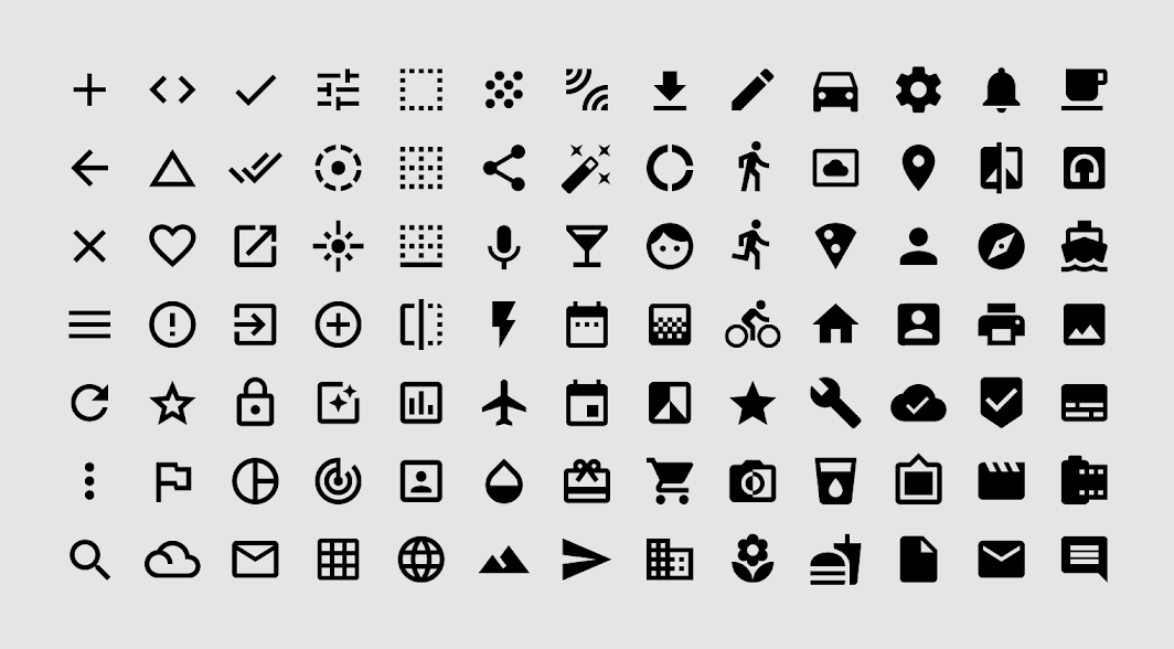
Material Icons are available in five styles. The icons are based on the core Material Design principles and metrics.
[material.io/design/iconography/system-icons](https://material.io/design/iconography/system-icons.html)
* [Icons]
### Filled
Filled icons (previously the only available style, also known as the baseline style) are the default icon style.
* [Icons.Filled]
### Outlined
Outlined icons make use of a thin stroke and empty space inside for a lighter appearance.
* [Icons.Outlined]
### Rounded
Rounded icons use a corner radius that pairs well with brands that use heavier typography, curved logos, or circular elements to express their style.
* [Icons.Rounded]
### Two tone
Two tone icons display corners with straight edges, for a crisp style that remains legible even at smaller scales.
* [Icons.TwoTone]
### Sharp
Sharp icons display corners with straight edges, for a crisp style that remains legible even at smaller scales.
* [Icons.Sharp]