/*
* Copyright 2023 The Android Open Source Project
*
* Licensed under the Apache License, Version 2.0 (the "License");
* you may not use this file except in compliance with the License.
* You may obtain a copy of the License at
*
* http://www.apache.org/licenses/LICENSE-2.0
*
* Unless required by applicable law or agreed to in writing, software
* distributed under the License is distributed on an "AS IS" BASIS,
* WITHOUT WARRANTIES OR CONDITIONS OF ANY KIND, either express or implied.
* See the License for the specific language governing permissions and
* limitations under the License.
*/
package androidx.tv.material3
import androidx.annotation.FloatRange
import androidx.compose.foundation.BorderStroke
import androidx.compose.foundation.interaction.Interaction
import androidx.compose.foundation.interaction.MutableInteractionSource
import androidx.compose.foundation.layout.Box
import androidx.compose.foundation.layout.BoxScope
import androidx.compose.foundation.layout.Column
import androidx.compose.foundation.layout.ColumnScope
import androidx.compose.foundation.layout.PaddingValues
import androidx.compose.foundation.layout.Row
import androidx.compose.foundation.layout.aspectRatio
import androidx.compose.foundation.layout.padding
import androidx.compose.foundation.shape.RoundedCornerShape
import androidx.compose.runtime.Composable
import androidx.compose.runtime.ReadOnlyComposable
import androidx.compose.ui.Alignment
import androidx.compose.ui.Modifier
import androidx.compose.ui.draw.drawWithCache
import androidx.compose.ui.graphics.Brush
import androidx.compose.ui.graphics.Color
import androidx.compose.ui.graphics.Shape
import androidx.compose.ui.graphics.graphicsLayer
import androidx.compose.ui.unit.dp
/**
* Cards contain content and actions that relate information about a subject.
*
* This Card handles click events, calling its [onClick] lambda.
*
* Checkout <a href="https://developer.android.com/design/ui/tv/guides/components/cards#usage">TV Guidelines for Aspect ratios</a> for cards
*
* @sample androidx.tv.samples.HorizontalImageAspectRatioCardSample
* @sample androidx.tv.samples.VerticalImageAspectRatioCardSample
* @sample androidx.tv.samples.SquareImageAspectRatioCardSample
*
* @param onClick called when this card is clicked.
* @param modifier the [Modifier] to be applied to this card.
* @param onLongClick called when this card is long clicked (long-pressed).
* @param shape [CardShape] defines the shape of this card's container in different interaction
* states. See [CardDefaults.shape].
* @param colors [CardColors] defines the background & content colors used in this card for
* different interaction states. See [CardDefaults.colors].
* @param scale [CardScale] defines size of the card relative to its original size for different
* interaction states. See [CardDefaults.scale].
* @param border [CardBorder] defines a border around the card for different interaction states.
* See [CardDefaults.border].
* @param glow [CardGlow] defines a shadow to be shown behind the card for different interaction
* states. See [CardDefaults.glow].
* @param interactionSource an optional hoisted [MutableInteractionSource] for observing and
* emitting [Interaction]s for this card. You can use this to change the card's appearance
* or preview the card in different states. Note that if `null` is provided, interactions will
* still happen internally.
* @param content defines the [Composable] content inside the Card.
*/
@Composable
fun Card(
onClick: () -> Unit,
modifier: Modifier = Modifier,
onLongClick: (() -> Unit)? = null,
shape: CardShape = CardDefaults.shape(),
colors: CardColors = CardDefaults.colors(),
scale: CardScale = CardDefaults.scale(),
border: CardBorder = CardDefaults.border(),
glow: CardGlow = CardDefaults.glow(),
interactionSource: MutableInteractionSource? = null,
content: @Composable ColumnScope.() -> Unit
) {
Surface(
onClick = onClick,
onLongClick = onLongClick,
modifier = modifier,
shape = shape.toClickableSurfaceShape(),
colors = colors.toClickableSurfaceColors(),
scale = scale.toClickableSurfaceScale(),
border = border.toClickableSurfaceBorder(),
glow = glow.toClickableSurfaceGlow(),
interactionSource = interactionSource,
) {
Column(content = content)
}
}
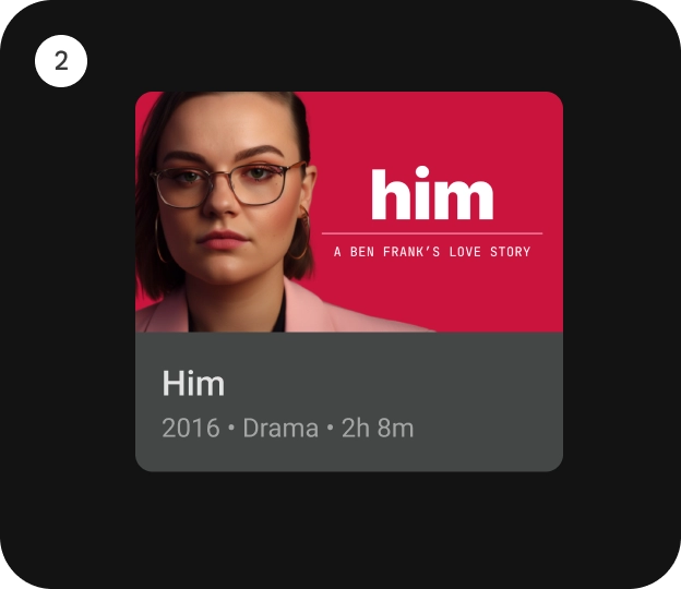
/**
* [ClassicCard] is an opinionated TV Material card that offers a 4 slot layout to show
* information about a subject.
*
* This card has a vertical layout with the interactive surface [Surface], which provides the image
* slot at the top, followed by the title, subtitle, and description slots.
*
* 
*
* Checkout TV design guidelines to learn more about <a href="https://developer.android.com/design/ui/tv/guides/components/cards#classic-card" class="external" target="_blank">Material Classic Card</a>.
*
* This Card handles click events, calling its [onClick] lambda.
*
* @sample androidx.tv.samples.ClassicCardSample
*
* @param onClick called when this card is clicked.
* @param image defines the [Composable] image to be displayed on top of the Card.
* @param title defines the [Composable] title placed below the image in the Card.
* @param modifier the [Modifier] to be applied to this card.
* @param onLongClick called when this card is long clicked (long-pressed).
* @param subtitle defines the [Composable] supporting text placed below the title of the Card.
* @param description defines the [Composable] description placed below the subtitle of the Card.
* @param shape [CardShape] defines the shape of this card's container in different interaction
* states. See [CardDefaults.shape].
* @param colors [CardColors] defines the background & content colors used in this card for
* different interaction states. See [CardDefaults.colors].
* @param scale [CardScale] defines size of the card relative to its original size for different
* interaction states. See [CardDefaults.scale].
* @param border [CardBorder] defines a border around the card for different interaction states.
* See [CardDefaults.border].
* @param glow [CardGlow] defines a shadow to be shown behind the card for different interaction
* states. See [CardDefaults.glow].
* @param contentPadding [PaddingValues] defines the inner padding applied to the card's content.
* @param interactionSource an optional hoisted [MutableInteractionSource] for observing and
* emitting [Interaction]s for this card. You can use this to change the card's appearance
* or preview the card in different states. Note that if `null` is provided, interactions will
* still happen internally.
*/
@Composable
fun ClassicCard(
onClick: () -> Unit,
image: @Composable BoxScope.() -> Unit,
title: @Composable () -> Unit,
modifier: Modifier = Modifier,
onLongClick: (() -> Unit)? = null,
subtitle: @Composable () -> Unit = {},
description: @Composable () -> Unit = {},
shape: CardShape = CardDefaults.shape(),
colors: CardColors = CardDefaults.colors(),
scale: CardScale = CardDefaults.scale(),
border: CardBorder = CardDefaults.border(),
glow: CardGlow = CardDefaults.glow(),
contentPadding: PaddingValues = PaddingValues(),
interactionSource: MutableInteractionSource? = null
) {
Card(
onClick = onClick,
onLongClick = onLongClick,
modifier = modifier,
interactionSource = interactionSource,
shape = shape,
colors = colors,
scale = scale,
border = border,
glow = glow
) {
Column(
modifier = Modifier.padding(contentPadding)
) {
Box(
contentAlignment = CardDefaults.ContentImageAlignment,
content = image
)
Column {
CardContent(
title = title,
subtitle = subtitle,
description = description
)
}
}
}
}
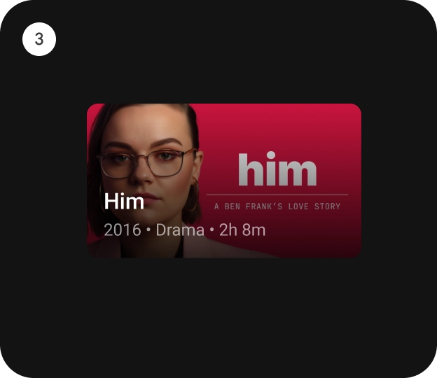
/**
* [CompactCard] is an opinionated TV Material card that offers a 4 slot layout to show
* information about a subject.
*
* This card provides the interactive surface [Surface] with the image slot as the background
* (with an overlay scrim gradient). Other slots for the title, subtitle, and description are
* placed over it.
*
* 
*
* Checkout TV design guidelines to learn more about <a href="https://developer.android.com/design/ui/tv/guides/components/cards#compact-card" class="external" target="_blank">Material Compact Card</a>.
*
* This Card handles click events, calling its [onClick] lambda.
*
* @sample androidx.tv.samples.CompactCardSample
*
* @param onClick called when this card is clicked.
* @param image defines the [Composable] image to be displayed on top of the Card.
* @param title defines the [Composable] title placed below the image in the Card.
* @param modifier the [Modifier] to be applied to this card.
* @param onLongClick called when this card is long clicked (long-pressed).
* @param subtitle defines the [Composable] supporting text placed below the title of the Card.
* @param description defines the [Composable] description placed below the subtitle of the Card.
* @param shape [CardShape] defines the shape of this card's container in different interaction
* states. See [CardDefaults.shape].
* @param colors [CardColors] defines the background & content colors used in this card for
* different interaction states. See [CardDefaults.compactCardColors].
* @param scale [CardScale] defines size of the card relative to its original size for different
* interaction states. See [CardDefaults.scale].
* @param border [CardBorder] defines a border around the card for different interaction states.
* See [CardDefaults.border].
* @param glow [CardGlow] defines a shadow to be shown behind the card for different interaction
* states. See [CardDefaults.glow].
* @param scrimBrush [Brush] defines a brush/gradient to be used to draw the scrim over the image
* in the background. See [CardDefaults.ScrimBrush].
* @param interactionSource an optional hoisted [MutableInteractionSource] for observing and
* emitting [Interaction]s for this card. You can use this to change the card's appearance
* or preview the card in different states. Note that if `null` is provided, interactions will
* still happen internally.
*/
@Composable
fun CompactCard(
onClick: () -> Unit,
image: @Composable BoxScope.() -> Unit,
title: @Composable () -> Unit,
modifier: Modifier = Modifier,
onLongClick: (() -> Unit)? = null,
subtitle: @Composable () -> Unit = {},
description: @Composable () -> Unit = {},
shape: CardShape = CardDefaults.shape(),
colors: CardColors = CardDefaults.compactCardColors(),
scale: CardScale = CardDefaults.scale(),
border: CardBorder = CardDefaults.border(),
glow: CardGlow = CardDefaults.glow(),
scrimBrush: Brush = CardDefaults.ScrimBrush,
interactionSource: MutableInteractionSource? = null
) {
Card(
onClick = onClick,
onLongClick = onLongClick,
modifier = modifier,
interactionSource = interactionSource,
shape = shape,
colors = colors,
scale = scale,
border = border,
glow = glow
) {
Box(contentAlignment = Alignment.BottomStart) {
Box(
modifier = Modifier
.drawWithCache {
onDrawWithContent {
drawContent()
drawRect(brush = scrimBrush)
}
},
contentAlignment = CardDefaults.ContentImageAlignment,
content = image
)
Column {
CardContent(
title = title,
subtitle = subtitle,
description = description
)
}
}
}
}
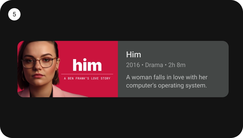
/**
* [WideClassicCard] is an opinionated TV Material card that offers a 4 slot layout to show
* information about a subject.
*
* This card has a horizontal layout with the interactive surface [Surface], which provides the
* image slot at the start, followed by the title, subtitle, and description slots at the end.
*
* This Card handles click events, calling its [onClick] lambda.
*
* 
*
* Checkout TV design guidelines to learn more about <a href="https://developer.android.com/design/ui/tv/guides/components/cards#wide-classic-card" class="external" target="_blank">Material Wide Classic Card</a>.
*
* @sample androidx.tv.samples.WideClassicCardSample
*
* @param onClick called when this card is clicked.
* @param image defines the [Composable] image to be displayed on top of the Card.
* @param title defines the [Composable] title placed below the image in the Card.
* @param modifier the [Modifier] to be applied to this card.
* @param onLongClick called when this card is long clicked (long-pressed).
* @param subtitle defines the [Composable] supporting text placed below the title of the Card.
* @param description defines the [Composable] description placed below the subtitle of the Card.
* @param shape [CardShape] defines the shape of this card's container in different interaction
* states. See [CardDefaults.shape].
* @param colors [CardColors] defines the background & content colors used in this card for
* different interaction states. See [CardDefaults.colors].
* @param scale [CardScale] defines size of the card relative to its original size for different
* interaction states. See [CardDefaults.scale].
* @param border [CardBorder] defines a border around the card for different interaction states.
* See [CardDefaults.border].
* @param glow [CardGlow] defines a shadow to be shown behind the card for different interaction
* states. See [CardDefaults.glow].
* @param contentPadding [PaddingValues] defines the inner padding applied to the card's content.
* @param interactionSource an optional hoisted [MutableInteractionSource] for observing and
* emitting [Interaction]s for this card. You can use this to change the card's appearance
* or preview the card in different states. Note that if `null` is provided, interactions will
* still happen internally.
*/
@Composable
fun WideClassicCard(
onClick: () -> Unit,
image: @Composable BoxScope.() -> Unit,
title: @Composable () -> Unit,
modifier: Modifier = Modifier,
onLongClick: (() -> Unit)? = null,
subtitle: @Composable () -> Unit = {},
description: @Composable () -> Unit = {},
shape: CardShape = CardDefaults.shape(),
colors: CardColors = CardDefaults.colors(),
scale: CardScale = CardDefaults.scale(),
border: CardBorder = CardDefaults.border(),
glow: CardGlow = CardDefaults.glow(),
contentPadding: PaddingValues = PaddingValues(),
interactionSource: MutableInteractionSource? = null
) {
Card(
onClick = onClick,
onLongClick = onLongClick,
modifier = modifier,
interactionSource = interactionSource,
shape = shape,
colors = colors,
scale = scale,
border = border,
glow = glow
) {
Row(
modifier = Modifier.padding(contentPadding)
) {
Box(
contentAlignment = CardDefaults.ContentImageAlignment,
content = image
)
Column {
CardContent(
title = title,
subtitle = subtitle,
description = description
)
}
}
}
}
@Composable
internal fun CardContent(
title: @Composable () -> Unit,
subtitle: @Composable () -> Unit = {},
description: @Composable () -> Unit = {}
) {
ProvideTextStyle(MaterialTheme.typography.titleMedium) {
title.invoke()
}
ProvideTextStyle(MaterialTheme.typography.bodySmall) {
Box(Modifier.graphicsLayer { alpha = SubtitleAlpha }) {
subtitle.invoke()
}
}
ProvideTextStyle(MaterialTheme.typography.bodySmall) {
Box(Modifier.graphicsLayer { alpha = DescriptionAlpha }) {
description.invoke()
}
}
}
/**
* Contains the default values used by all card types.
*/
object CardDefaults {
internal val ContentImageAlignment = Alignment.Center
/**
* The default [Shape] used by Cards.
*/
private val ContainerShape = RoundedCornerShape(8.dp)
/**
* Recommended aspect ratio [Float] to get square images, can be applied using the modifier
* [Modifier.aspectRatio].
*/
const val SquareImageAspectRatio = 1f
/**
* Recommended aspect ratio [Float] for vertical images, can be applied using the modifier
* [Modifier.aspectRatio].
*/
const val VerticalImageAspectRatio = 2f / 3
/**
* Recommended aspect ratio [Float] for horizontal images, can be applied using the modifier
* [Modifier.aspectRatio].
*/
const val HorizontalImageAspectRatio = 16f / 9
/**
* Gradient used in cards to give more emphasis to the textual content that is generally
* displayed above an image.
*/
val ScrimBrush = Brush.verticalGradient(
listOf(
Color(red = 28, green = 27, blue = 31, alpha = 0),
Color(red = 28, green = 27, blue = 31, alpha = 204)
)
)
/**
* Creates a [CardShape] that represents the default container shapes used in a Card.
*
* @param shape the default shape used when the Card has no other [Interaction]s.
* @param focusedShape the shape used when the Card is focused.
* @param pressedShape the shape used when the Card is pressed.
*/
fun shape(
shape: Shape = ContainerShape,
focusedShape: Shape = shape,
pressedShape: Shape = shape
) = CardShape(
shape = shape,
focusedShape = focusedShape,
pressedShape = pressedShape
)
/**
* Creates [CardColors] that represents the default container & content colors used in a Card.
*
* @param containerColor the default container color of this Card.
* @param contentColor the default content color of this Card.
* @param focusedContainerColor the container color of this Card when focused.
* @param focusedContentColor the content color of this Card when focused.
* @param pressedContainerColor the container color of this Card when pressed.
* @param pressedContentColor the content color of this Card when pressed.
*/
@ReadOnlyComposable
@Composable
fun colors(
containerColor: Color = MaterialTheme.colorScheme.surfaceVariant,
contentColor: Color = contentColorFor(containerColor),
focusedContainerColor: Color = containerColor,
focusedContentColor: Color = contentColorFor(focusedContainerColor),
pressedContainerColor: Color = focusedContainerColor,
pressedContentColor: Color = contentColorFor(pressedContainerColor)
) = CardColors(
containerColor = containerColor,
contentColor = contentColor,
focusedContainerColor = focusedContainerColor,
focusedContentColor = focusedContentColor,
pressedContainerColor = pressedContainerColor,
pressedContentColor = pressedContentColor
)
/**
* Creates [CardColors] that represents the default colors used in a Compact Card.
*
* @param containerColor the default container color of this Card.
* @param contentColor the default content color of this Card.
* @param focusedContainerColor the container color of this Card when focused.
* @param focusedContentColor the content color of this Card when focused.
* @param pressedContainerColor the container color of this Card when pressed.
* @param pressedContentColor the content color of this Card when pressed.
*/
@ReadOnlyComposable
@Composable
fun compactCardColors(
containerColor: Color = MaterialTheme.colorScheme.surfaceVariant,
contentColor: Color = Color.White,
focusedContainerColor: Color = containerColor,
focusedContentColor: Color = contentColor,
pressedContainerColor: Color = focusedContainerColor,
pressedContentColor: Color = focusedContentColor
) = CardColors(
containerColor = containerColor,
contentColor = contentColor,
focusedContainerColor = focusedContainerColor,
focusedContentColor = focusedContentColor,
pressedContainerColor = pressedContainerColor,
pressedContentColor = pressedContentColor
)
/**
* Creates a [CardScale] that represents the default scales used in a Card.
* Scales are used to modify the size of a composable in different [Interaction] states
* e.g. 1f (original) in default state, 1.1f (scaled up) in focused state, 0.8f (scaled down)
* in pressed state, etc.
*
* @param scale the default scale to be used for this Card.
* @param focusedScale the scale to be used for this Card when focused.
* @param pressedScale the scale to be used for this Card when pressed.
*/
fun scale(
@FloatRange(from = 0.0) scale: Float = 1f,
@FloatRange(from = 0.0) focusedScale: Float = 1.1f,
@FloatRange(from = 0.0) pressedScale: Float = scale
) = CardScale(
scale = scale,
focusedScale = focusedScale,
pressedScale = pressedScale
)
/**
* Creates a [CardBorder] that represents the border [Border]s applied on a Card in
* different [Interaction] states.
*
* @param border the default [Border] to be used for this Card.
* @param focusedBorder the [Border] to be used for this Card when focused.
* @param pressedBorder the [Border] to be used for this Card when pressed.
*/
@ReadOnlyComposable
@Composable
fun border(
border: Border = Border.None,
focusedBorder: Border = Border(
border = BorderStroke(
width = 3.dp,
color = MaterialTheme.colorScheme.border
),
shape = ContainerShape
),
pressedBorder: Border = focusedBorder
) = CardBorder(
border = border,
focusedBorder = focusedBorder,
pressedBorder = pressedBorder
)
/**
* Creates a [CardGlow] that represents the default [Glow]s used in a card.
*
* @param glow the default [Glow] behind this Card.
* @param focusedGlow the [Glow] behind this Card when focused.
* @param pressedGlow the [Glow] behind this Card when pressed.
*/
fun glow(
glow: Glow = Glow.None,
focusedGlow: Glow = glow,
pressedGlow: Glow = glow
) = CardGlow(
glow = glow,
focusedGlow = focusedGlow,
pressedGlow = pressedGlow
)
}
private const val SubtitleAlpha = 0.6f
private const val DescriptionAlpha = 0.8f
private fun CardColors.toClickableSurfaceColors() =
ClickableSurfaceColors(
containerColor = containerColor,
contentColor = contentColor,
focusedContainerColor = focusedContainerColor,
focusedContentColor = focusedContentColor,
pressedContainerColor = pressedContainerColor,
pressedContentColor = pressedContentColor,
disabledContainerColor = containerColor,
disabledContentColor = contentColor
)
private fun CardShape.toClickableSurfaceShape() =
ClickableSurfaceShape(
shape = shape,
focusedShape = focusedShape,
pressedShape = pressedShape,
disabledShape = shape,
focusedDisabledShape = shape
)
private fun CardScale.toClickableSurfaceScale() =
ClickableSurfaceScale(
scale = scale,
focusedScale = focusedScale,
pressedScale = pressedScale,
disabledScale = scale,
focusedDisabledScale = scale
)
private fun CardBorder.toClickableSurfaceBorder() =
ClickableSurfaceBorder(
border = border,
focusedBorder = focusedBorder,
pressedBorder = pressedBorder,
disabledBorder = border,
focusedDisabledBorder = border
)
private fun CardGlow.toClickableSurfaceGlow() =
ClickableSurfaceGlow(
glow = glow,
focusedGlow = focusedGlow,
pressedGlow = pressedGlow
)