/*
* Copyright 2023 The Android Open Source Project
*
* Licensed under the Apache License, Version 2.0 (the "License");
* you may not use this file except in compliance with the License.
* You may obtain a copy of the License at
*
* http://www.apache.org/licenses/LICENSE-2.0
*
* Unless required by applicable law or agreed to in writing, software
* distributed under the License is distributed on an "AS IS" BASIS,
* WITHOUT WARRANTIES OR CONDITIONS OF ANY KIND, either express or implied.
* See the License for the specific language governing permissions and
* limitations under the License.
*/
package androidx.tv.material3
import androidx.compose.foundation.interaction.Interaction
import androidx.compose.foundation.interaction.MutableInteractionSource
import androidx.compose.foundation.interaction.collectIsFocusedAsState
import androidx.compose.foundation.interaction.collectIsPressedAsState
import androidx.compose.foundation.layout.Box
import androidx.compose.foundation.layout.Column
import androidx.compose.foundation.layout.Row
import androidx.compose.runtime.Composable
import androidx.compose.runtime.CompositionLocalProvider
import androidx.compose.runtime.Immutable
import androidx.compose.runtime.ReadOnlyComposable
import androidx.compose.runtime.getValue
import androidx.compose.runtime.remember
import androidx.compose.ui.Alignment
import androidx.compose.ui.Modifier
import androidx.compose.ui.graphics.Color
/**
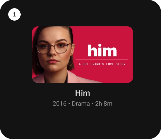
* [StandardCardContainer] is an opinionated TV Material Card layout with an image and text content
* to show information about a subject.
*
* It provides a vertical layout with an image card slot at the top. And below that, there are
* slots for the title, subtitle and description.
*
* 
*
* Checkout TV design guidelines to learn more about <a href="https://developer.android.com/design/ui/tv/guides/components/cards#standard-card" class="external" target="_blank">Material Standard Card</a>.
*
* @sample androidx.tv.samples.StandardCardContainerSample
*
* @param imageCard defines the [Composable] to be used for the image card.
* @param title defines the [Composable] title placed below the image card in the CardContainer.
* @param modifier the [Modifier] to be applied to this CardContainer.
* @param subtitle defines the [Composable] supporting text placed below the title in CardContainer.
* @param description defines the [Composable] description placed below the subtitle in CardContainer.
* @param contentColor [CardContainerColors] defines the content color used in the CardContainer
* for different interaction states. See [CardContainerDefaults.contentColor].
* @param interactionSource a hoisted [MutableInteractionSource] for observing and emitting
* [Interaction]s for this CardContainer.
* This interaction source param would also be forwarded to be used with the `imageCard` composable.
*/
@Composable
fun StandardCardContainer(
imageCard: @Composable (interactionSource: MutableInteractionSource) -> Unit,
title: @Composable () -> Unit,
modifier: Modifier = Modifier,
subtitle: @Composable () -> Unit = {},
description: @Composable () -> Unit = {},
contentColor: CardContainerColors = CardContainerDefaults.contentColor(),
interactionSource: MutableInteractionSource = remember { MutableInteractionSource() }
) {
val focused by interactionSource.collectIsFocusedAsState()
val pressed by interactionSource.collectIsPressedAsState()
Column(
modifier = modifier
) {
Box(
contentAlignment = CardDefaults.ContentImageAlignment,
) {
imageCard(interactionSource)
}
Column(
modifier = Modifier
.align(Alignment.CenterHorizontally),
horizontalAlignment = Alignment.CenterHorizontally
) {
CardContainerContent(
title = title,
subtitle = subtitle,
description = description,
contentColor = contentColor.color(
focused = focused,
pressed = pressed
)
)
}
}
}
/**
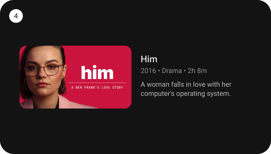
* [WideCardContainer] is an opinionated TV Material Card layout with an image and text content
* to show information about a subject.
*
* It provides a horizontal layout with an image card slot at the start, followed by the title,
* subtitle and description at the end.
*
* 
*
* Checkout TV design guidelines to learn more about <a href="https://developer.android.com/design/ui/tv/guides/components/cards#wide-standard-card" class="external" target="_blank">Material Wide Standard Card</a>.
*
* @sample androidx.tv.samples.WideCardContainerSample
*
* @param imageCard defines the [Composable] to be used for the image card.
* @param title defines the [Composable] title placed below the image card in the CardContainer.
* @param modifier the [Modifier] to be applied to this CardContainer.
* @param subtitle defines the [Composable] supporting text placed below the title in CardContainer.
* @param description defines the [Composable] description placed below the subtitle in CardContainer.
* @param contentColor [CardContainerColors] defines the content color used in the CardContainer
* for different interaction states. See [CardContainerDefaults.contentColor].
* @param interactionSource a hoisted [MutableInteractionSource] for observing and emitting
* [Interaction]s for this CardContainer.
* This interaction source param would also be forwarded to be used with the `imageCard` composable.
*/
@Composable
fun WideCardContainer(
imageCard: @Composable (interactionSource: MutableInteractionSource) -> Unit,
title: @Composable () -> Unit,
modifier: Modifier = Modifier,
subtitle: @Composable () -> Unit = {},
description: @Composable () -> Unit = {},
contentColor: CardContainerColors = CardContainerDefaults.contentColor(),
interactionSource: MutableInteractionSource = remember { MutableInteractionSource() }
) {
val focused by interactionSource.collectIsFocusedAsState()
val pressed by interactionSource.collectIsPressedAsState()
Row(
modifier = modifier
) {
Box(
contentAlignment = CardDefaults.ContentImageAlignment
) {
imageCard(interactionSource)
}
Column {
CardContainerContent(
title = title,
subtitle = subtitle,
description = description,
contentColor = contentColor.color(
focused = focused,
pressed = pressed
)
)
}
}
}
@Composable
internal fun CardContainerContent(
title: @Composable () -> Unit,
subtitle: @Composable () -> Unit = {},
description: @Composable () -> Unit = {},
contentColor: Color
) {
CompositionLocalProvider(LocalContentColor provides contentColor) {
CardContent(title, subtitle, description)
}
}
object CardContainerDefaults {
/**
* Creates [CardContainerColors] that represents the default content colors used in a
* CardContainer.
*
* @param contentColor the default content color of this CardContainer.
* @param focusedContentColor the content color of this CardContainer when focused.
* @param pressedContentColor the content color of this CardContainer when pressed.
*/
@ReadOnlyComposable
@Composable
fun contentColor(
contentColor: Color = MaterialTheme.colorScheme.onSurface,
focusedContentColor: Color = contentColor,
pressedContentColor: Color = focusedContentColor
) = CardContainerColors(
contentColor = contentColor,
focusedContentColor = focusedContentColor,
pressedContentColor = pressedContentColor
)
}
/**
* Represents the [Color] of content in a CardContainer for different interaction states.
*/
@Immutable
class CardContainerColors internal constructor(
internal val contentColor: Color,
internal val focusedContentColor: Color,
internal val pressedContentColor: Color,
) {
/**
* Returns the content color [Color] for different interaction states.
*/
internal fun color(
focused: Boolean,
pressed: Boolean
): Color {
return when {
focused -> focusedContentColor
pressed -> pressedContentColor
else -> contentColor
}
}
override fun equals(other: Any?): Boolean {
if (this === other) return true
if (other == null || this::class != other::class) return false
other as CardContainerColors
if (contentColor != other.contentColor) return false
if (focusedContentColor != other.focusedContentColor) return false
if (pressedContentColor != other.pressedContentColor) return false
return true
}
override fun hashCode(): Int {
var result = contentColor.hashCode()
result = 31 * result + focusedContentColor.hashCode()
result = 31 * result + pressedContentColor.hashCode()
return result
}
override fun toString(): String {
return "CardContainerContentColor(" +
"contentColor=$contentColor, " +
"focusedContentColor=$focusedContentColor, " +
"pressedContentColor=$pressedContentColor)"
}
}